Capterra: Software Profile
I was challenged with reconfiguring Capterra's product spotlight page to better serve our users and to introduce a number of new features including compare, resources, and more.
TLDR: Redesigned and iterated on Capterra's spotlight page to improve UX and conversion rate, and introduce a new frontend development framework to the site.
- Role: Lead UI Designer
- Software Used: Figma, Illustrator, Optimize, Hotjar
- +4% conversion rate
- 53% improvement in page speed

The Problem
Capterra’s "Spotlight" pages highlight software product specifications, features, and reviews. Users rely on Spotlight pages to perform deep research and validate assumptions.
Conversion rates were declining:
Users were not finding the right software products for their business needs
Bounce rates were increasing:
The page's value proposition was unclear and untrustworthy on initial load
Vendor conversion rates were declining:
Of the users who converted, they did not sign up for accounts with the software
The UI was outdated:
The last time the design was updated was nearly 5 years prior
Not all data was displayed:
Capterra had access to additional data, but was not displaying it on the page
Page performance lagged behind benchmarks:
Page speed, especially on mobile, didn't measure up to site standards

Research Findings
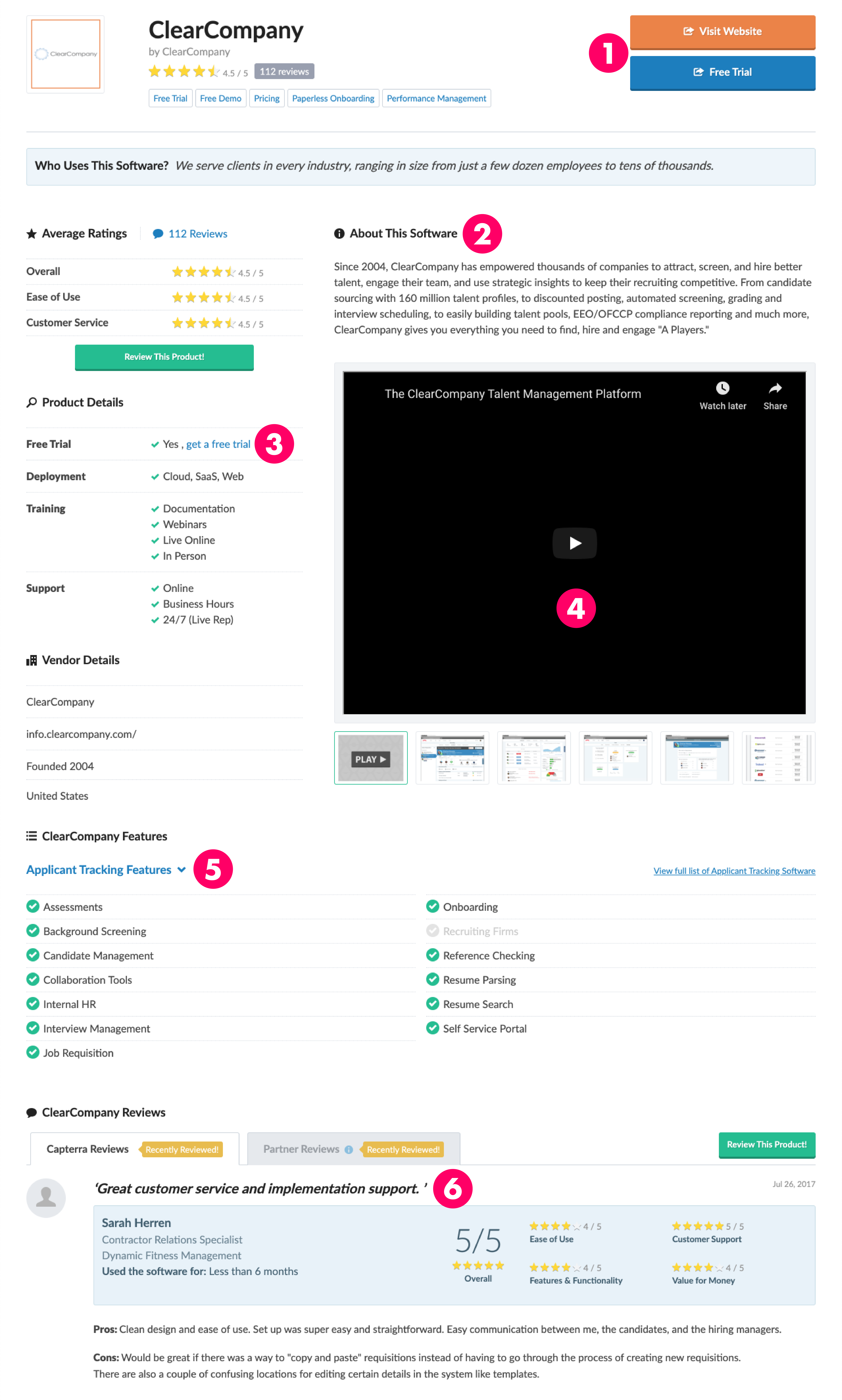
We surveyed 100 users, and interviewed 10, to identify major pain points and opportunities. I pulled screen recordings, heatmaps, and other quantitative user data to validate our findings.
1
Multiple buttons made it difficult for users to focus on any one CTA.
2
Long paragraphs of product descriptions were difficult for users to skim.
3
Users found pricing info the most valuable and important data on the page.
4
Product screenshots helped users determine if a software is user friendly.
5
Users found feature information helpful, but wanted more context.
6
Reviews were a vital element, but users wanted the ability to filter them.
Redesign #1
Overhauling the Spotlight page was an aesthetic, functional, and technical redesign. Product decisions were led by user needs: how can we provide the best information users need to make an informed buying decision?

Reviews Filter

Tech Specification Table

Features Accordions

Popular Comparisons
The first redesign of this page focused on implementing a scaled-back design aesthetic and updated hierarchy. In addition, we rolled out a number of new feature MVPs. We tracked the performance of the page for further iteration.
Reviews FilterCreate the ability for users to filter reviews by poster data, star rating, and more.
Tech Specification TableSurface new pricing, training, and deployment information in an easy-to-skim table.
Features AccordionsContinue to surface every product feature, but only expand the features relevant to the user's journey.
Popular ComparisonsSuggest relevant product comparisons that other users found helpful to provide additional context.
User Testing Findings
While the redesign succeeded in helping users decide whether or not a product was a good option for them, it introduced new frustrations like an overwhelming amount of content, and an underwhelming UI.
After launching the new Spotlight design, we closely monitored user engagement and performed a series of user surveys.

The Solution
Adding fresh and professional UI to a template is an important step in gaining user trust. Along with implementing a new token library, I also iterated on, and implemented new major features.
1
Hierarchy Redesign
I implemented a new style guide, and reoriented the layout to prioritize the most important data. I alternated colored backgrounds to better group blocks of content.
2
Pricing Section
The majority of users make their purchasing decision based on pricing information. Giving users more data, like pricing tiers, will allow them to make a more informed decision.
3
Embedded Comparison
Users consistently have trouble knowing whether or not a product is at, above, or below industry standard. Embedding comparisons directly on the page provides extra context.

4
Reviews Card & Filter
Users disliked that the reviews cards took up such a massive part of the page. Adding more information to the right side of the page makes the review section more valuable.
Key Learnings & Next Steps
As the organic traffic to this page continues to increase, optimizing and iterating on this template becomes even more important. User feedback and stakeholder needs will drive future product evolutions.

I found that emphasizing product screenshots, organizing the raw data into easier-to-read tables, and adding a subnavigation helped users quickly absorb the huge amount of product information on the Spotlight page.
Next steps include:
1
Optimize mobile for shallow research, and on-the-go interactions.
2
Test alternate sticky headers to reduce banner blindness
3
Roll out new design to live traffic
4
Continue to optimize page performance
Next Case Study 
D&D Character Creation App
Product Page Directory
Developed with Love by Amelia Peacock 2020


